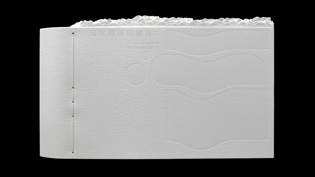
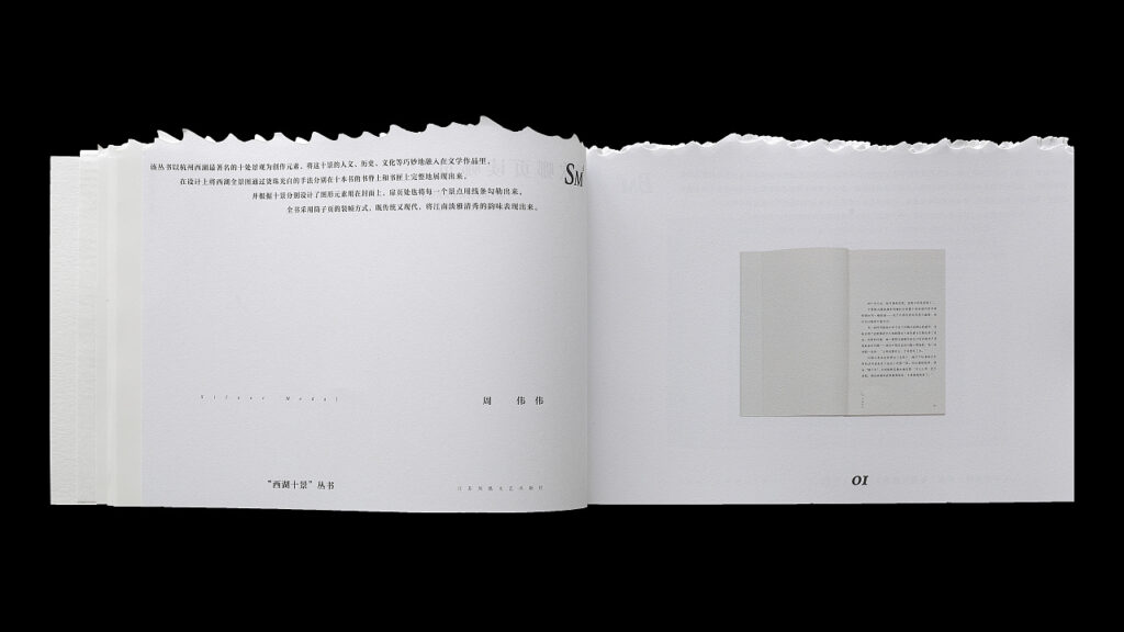
This is a book written by Liu Xiaoxiang, a famous book binding designer in China, and published by Hainan Publishing House. It is called “Read which page the wind blows“.
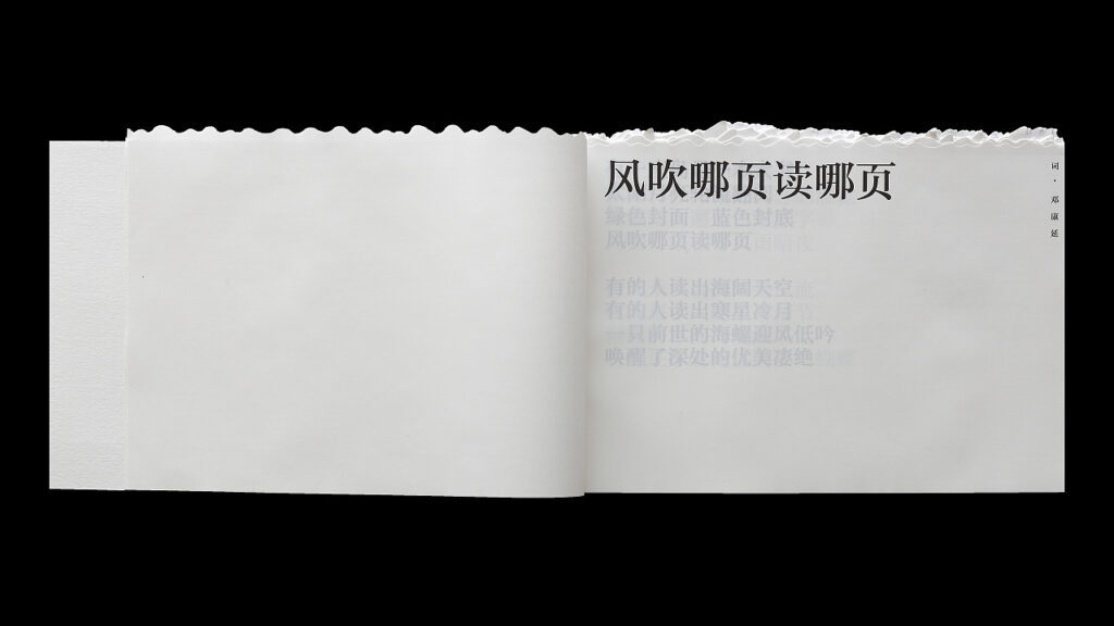
This book includes “the first China’s most beautiful travel book design competition works and the jury works”, the body of the book is composed of the winning books pictures and design instructions, the introduction of the concept of “the wind blows which page to read“, forming a “book within a book.
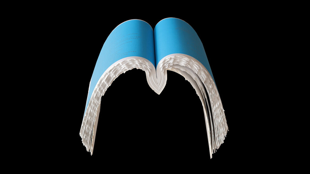
The book is shaped like a ship, inspired by the poem “The Road Not Taken” by American poet Robert Frost. The upper part of the book uses die cutting technology to create a three-dimensional effect of rolling waves, which gives readers a strong visual impact. In terms of typesetting, the book uses a relatively stable Founder Zhong Yasong as the text font, which forms a visual contrast with the whiteness of the whole body and makes the text of the work clear and easy to read.
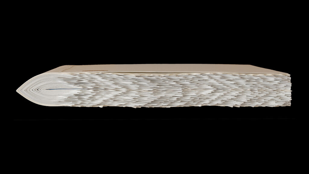
“Read which page the wind blows” A rapid succession of turns creates a surge of waves. Its binding adopts a symmetrical structure, with the judge’s speech as the center to spread out symmetrically. The main body of the book is made of Swedish Munken paper, which has a “soft” effect by keeping the paper pattern level with the binding.
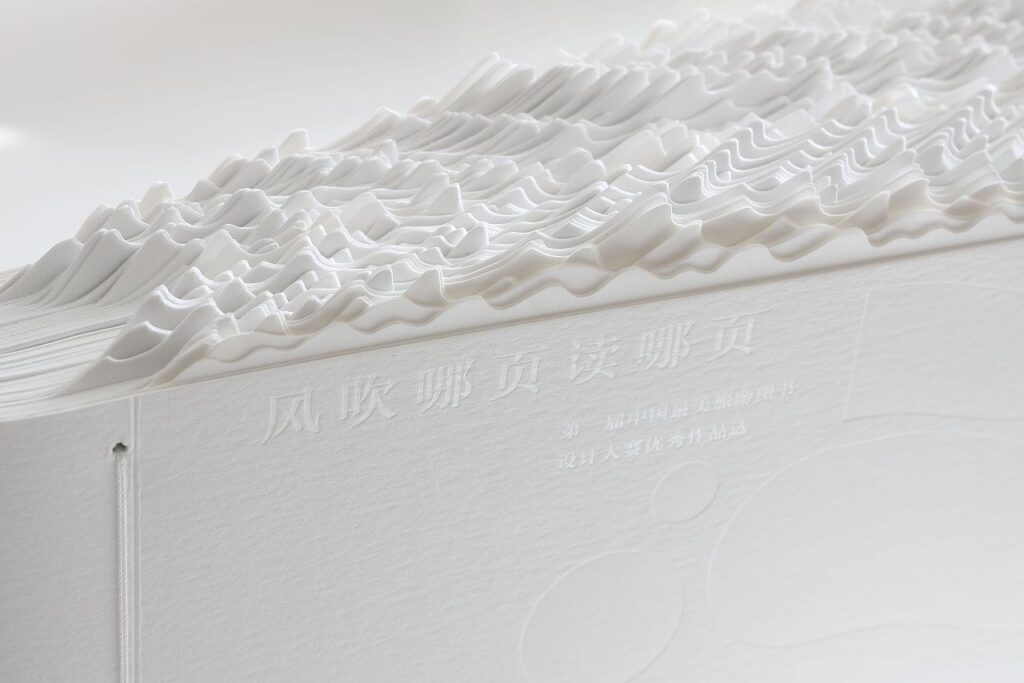
The Spine of the book effect that has surprised many people. This book is designed to express the idea of making reading a relaxing, emotional way of life, an island reading lifestyle that follows the heart with the sea breeze.