Feedback and promotion
In this Thursday’s tutorial, the tutor suggested some changes for each of our websites. In addition, I also gained a lot of opinions by communicating with my classmates. I have revised the following questions according to the suggestions of teachers and classmates.
- The ‘contact me’ function is too repetitive. I try to make every feature as visible as possible on the page, but I have my social media twice in one page, which is a bit redundant.
2. There is no reference in the blog. It’s unprofessional. A good reference in the paper will enable readers to quickly find out which literature or book the argument I quoted comes from, making the blog more persuasive and academic. Secondly, the teacher can also understand the depth of my research according to the reference I quoted. This is very necessary, so I will change this.
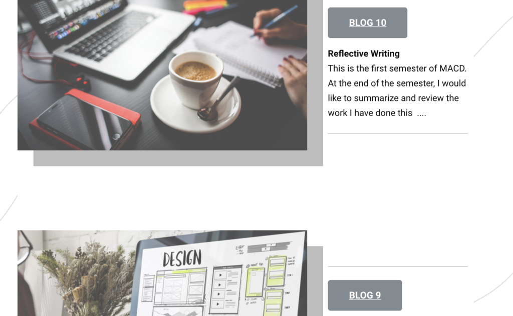
3. At blog navigation interface, the gap between two blogs is too large, making the page very empty, a waste of page space, and the picture is too small, cannot catch the interest of readers. It should be compact so that readers can see multiple blog profiles on a single page and visually capture their interest.
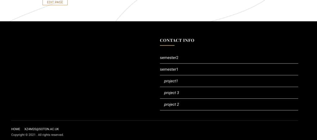
4. The content at the bottom of the page is not clear, so functional buttons should be added as needed. For example, ‘Back to project’
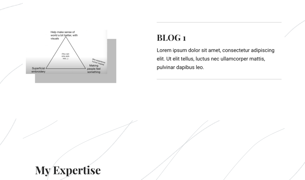
5. Blog content should not only state the production process, but also add the feelings and experience of the production, or the success and failure. Because this is not a teaching site, there is no need for too serious text. I should try to add more ‘my’ personal brand to my blog and think about how I can be different from other designers and be remembered, by making my blog more interesting, readers will spend more time on my page.